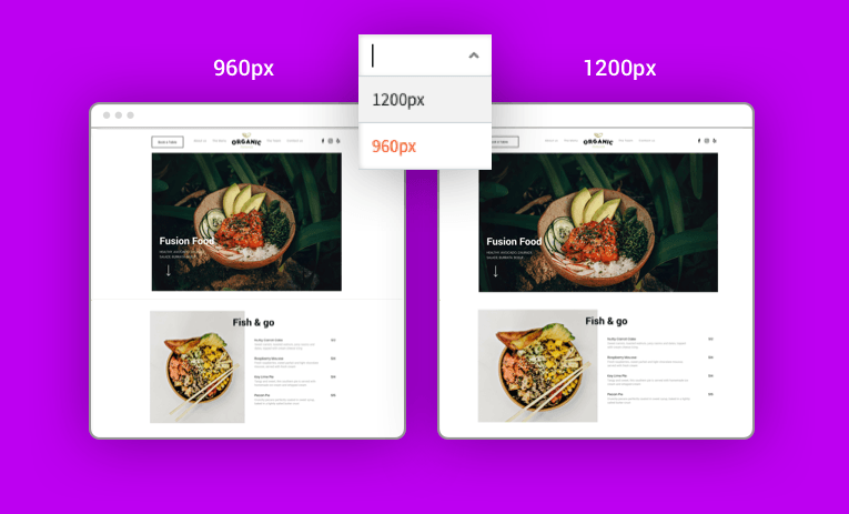
You can now set your desktop site width to 1200px, an increase over the previous 960px default. This new option expands your design capabilities as you build great-looking, modern sites for your clients.

Until now, all desktop sites were automatically set to 960px. To enable a wider screen for your site design, you could set rows to full bleed, and the design would stretch across the entire screen.
Now, we’ve made it easier to enable your site to cover wider screens, without having full bleed. The new 1200px desktop width option gives you more room to design, add columns, etc.
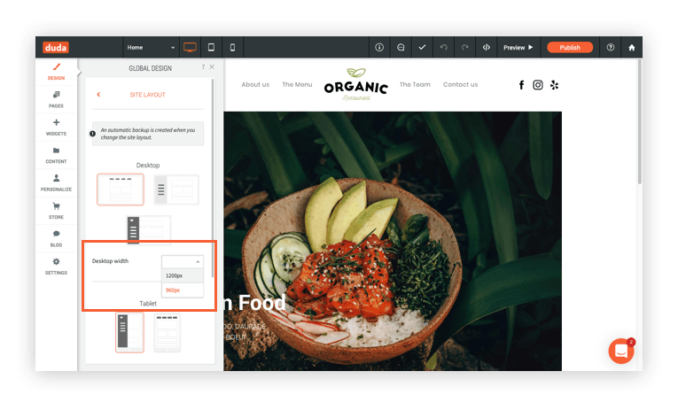
Set Desktop Width in Global Design
To expand your site width on desktop, simply go to Global Design > Site Layout and select 1200 in the Row width dropdown.

Great reasons for making your sites wider
Expanding the width of your sites is a subtle change that has many benefits, including:
- Ideal for modern website designs
- Greater design capabilities: for example 5-row inner columns that looks great
- Offers a nice balance between full-bleed and 960px width rows.
- More space for design elements (or for white space)
Note: This change has no effect on the tablet or mobile versions of your sites.

