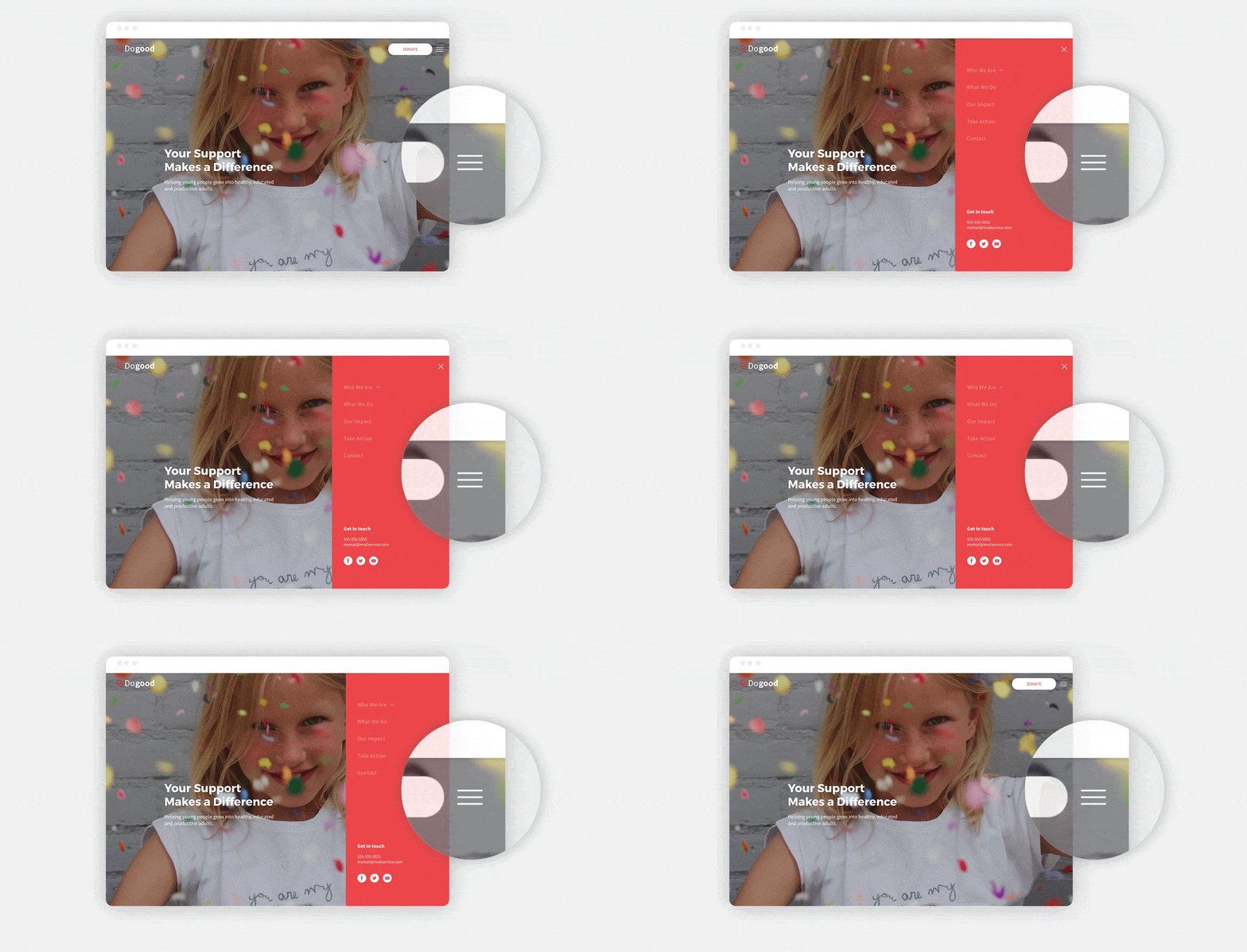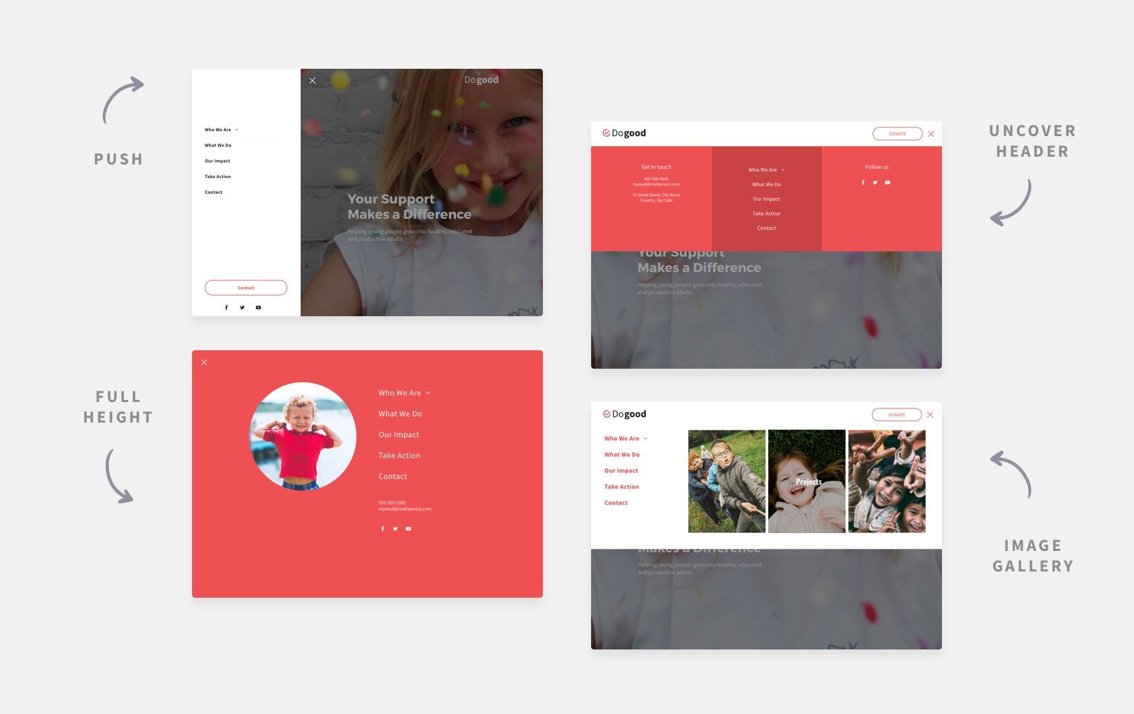
In addition to having expandable headers for mobile and tablet, you can now add expandable menus to your desktop sites, too. With this new capability, you’ll be able to give sites a modern look and allow more room for content such as images to shine.
Once you choose the expandable desktop layout (from the Site Layout tab), you’ll find 8 new expandable, fully customizable menu layouts, revealed by clicking on a hamburger icon.
Great reasons to use expandable headers in your desktop sites
- Give sites a modern look. Adding an expandable menu is an excellent (and easy!) way to give your sites a modern look. You can also freshen up existing sites by replacing the current header with an expandable menu.
- Do justice to image-rich sites. If you’re building websites for artists, photographers, design agencies, etc., you’ll want to allow maximum space for images. The expandable menu makes this possible, without compromising on content.
- Optimize space in one-pagers. In landing pages and one-pager sites, visitors can navigate the entire site easily on scroll, so having the navigation visible isn’t always necessary. The expandable menu enables you to hide navigation (while keeping it accessible), thereby optimizing space.
- Create rich menus that are visible anywhere. The expandable menu is fully customizable, so you can add any widgets that you like (and as many of them as you want). Users will be able to access these widgets regardless of where they are on the site simply by clicking the hamburger icon.
- Highlight important header icons and buttons. Want to a shopping cart icon that leads to checkout or social media icons that enable sharing to stand out in the header? The hamburger menu enables you to conceal other header items, so these ones stand out.
Here's how to get it
To add an expandable menu to any desktop site, open the Global Design panel and click Site Layout. From here, choose the bottom layout for desktop. If you have the same layout for both the desktop and tablet versions of your site, all edits will be applied to both versions.
Note that every expandable menu layout contains a different collection of widgets, and can be edited as much (or as little) as you like. Control the color and placement of the hamburger icon (right or left side of the header), how the expandable menu opens (from the top or side), and customize its width.

This update is the latest in a series of recent header improvements.

