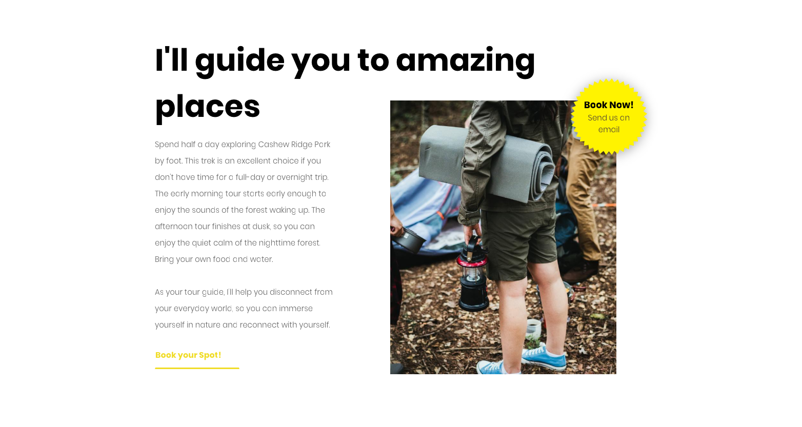
You’ve got 8 gorgeous new Sections, each one featuring the new Shape widget. Easy to add, they're perfect for highlighting features, plans, calls to action and more.
These Sections appear in the following categories: Intro, About, Features, Plans, Promotion, Restaurant, Text & Image. To organize them into your own categories, simply save the sections you love as Team Sections. For more on managing Sections, read this Team Section overview.
Intro Section
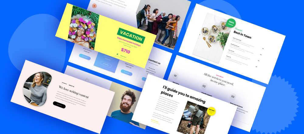
This section features a bold round shape as a button, drawing extra attention to the primary CTA.
To recreate this section on your own, add a row with 2 columns and follow these steps:
- In the left column, add a title, text and shape widget. Choose the circle shape and enter + in the widget's title area.
- In the right column, add an image as a background column. Add a shape widget, choose the triangle shape, set the color so it's the same color as the left column background, and set the left margin to -159px.
About Section
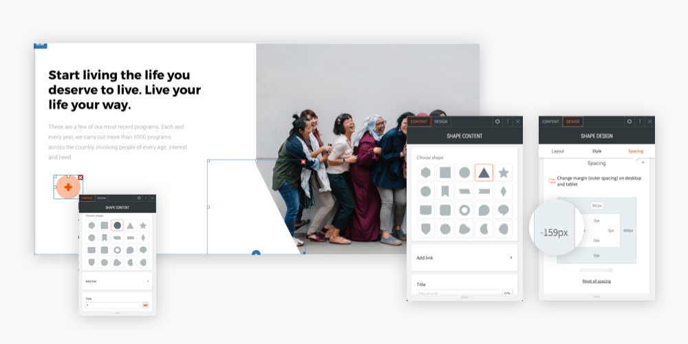
Creative companies deserve creative ways of displaying images. Rather than having a standard round or rectangular image, how about this bean-shaped one?
Feature Section
Here's a creative way of showing off a company's services and/or features.
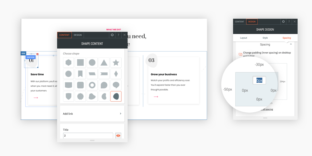
To recreate this section on your own, add a row with 3 columns and follow these steps:
- Add an inner row in each column. Set the inner row color to white and set an outer shadow.
- Add a shape, subtitle and text widget to each inner row. For the shape widget, set the color to gray and add a number in widget's title area. Set the left margin to -59px and the top margin to -30px.
Plans Section
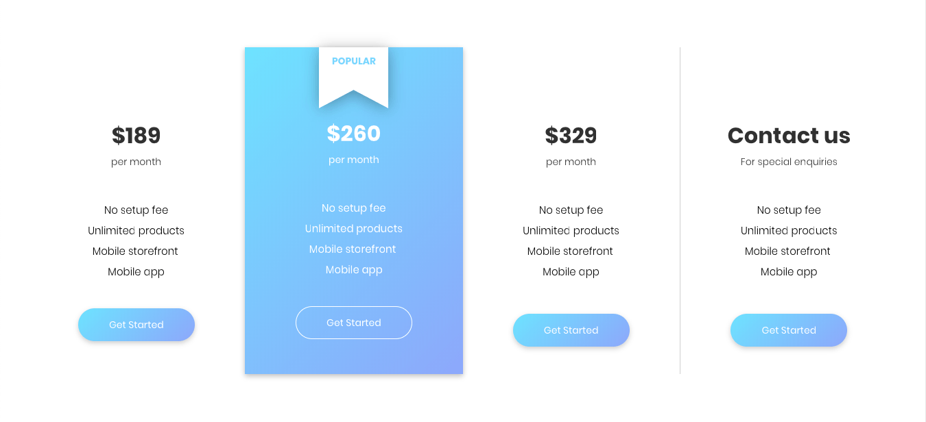
Draw attention to the plan you want customers to choose with a subtle flag and short text. Because when it comes to websites, the little details matter a lot.
Promotion Section
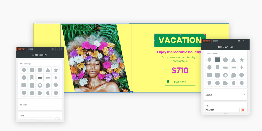
Give an image a bit more pizzazz by displaying it in a unique shape. It’s a small effect that can have a big impact. (We used the shape widget to create a bold title on the left side of this section, too.)
Restaurant Section
You can use this section to highlight a specific area of your menu.
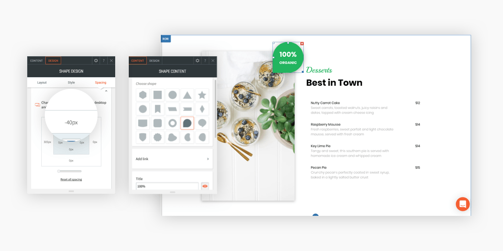
To recreate this section on your own, add a row with 2 columns and follow these steps:
- In the left column, add a slider background image and a shape widget. Choose the drop shape, set the widget's title to 100% and the description to ORGANIC. Set the alignment to right and the bottom margin to -40px.
- In the right column, add a subtitle, title and restaurant menu widget. Fill the widgets with your menu content.
Testimonial Section
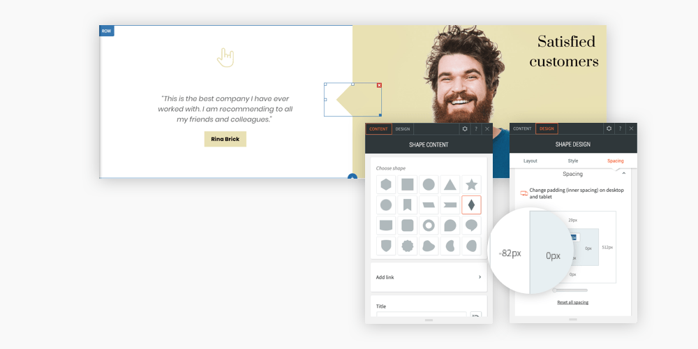
To recreate this section on your own, add a row with 2 columns.
- In the left column, add an icon and slider.
- In the right column, add a background color, image and 2 widgets: title and shape widget.
Text & Image Section
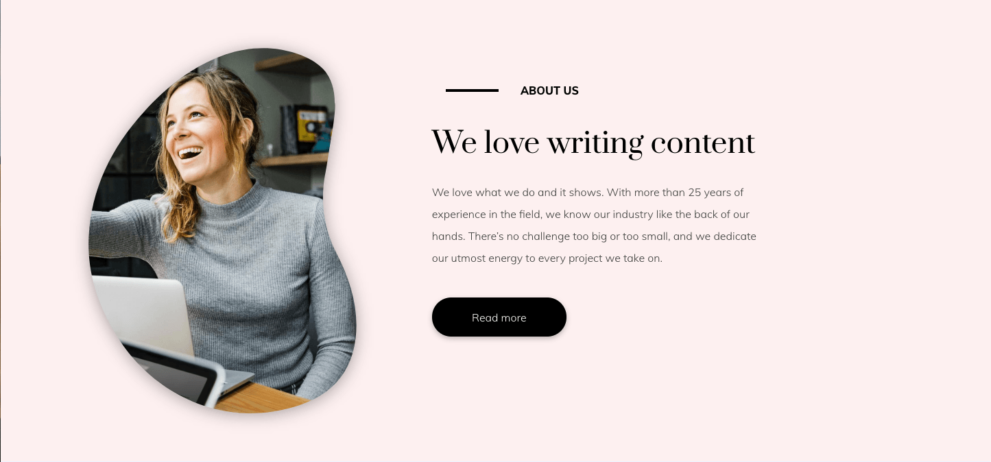
It doesn't take much to make an image stand out. In this section, a serrated circle is used to highlight the call to action.
