

Your desktop design capabilities just got an upgrade, with the new sidebar layout. It enables you to display your desktop site navigation vertically rather than horizontally, and allows for limitless customizations.
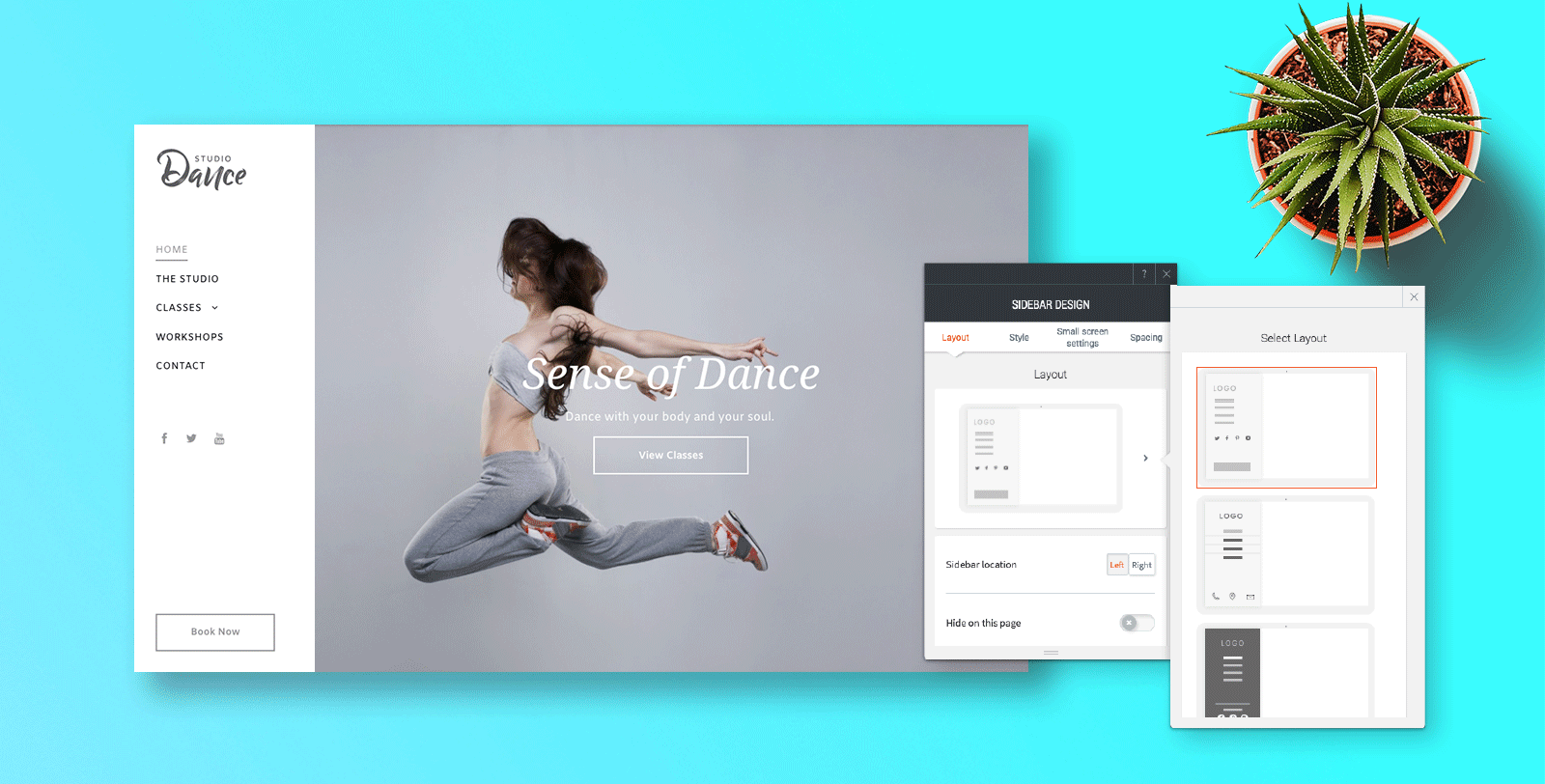
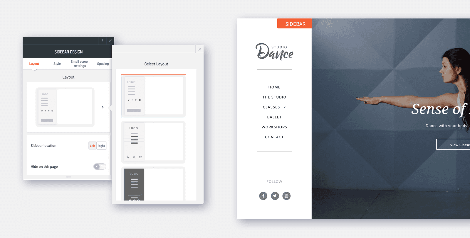
Choose from 4 new sidebar layouts, each of which contains a different combination of social icons and links, and can be fully customized. You can also decide whether the sidebar appears on the right or left side of the screen.
Great reasons to choose desktop sidebar layout
- In large sites that have lots of pages, the sidebar layout allows for more entries to be displayed in a less cluttered manner.
- If you want a clean, distraction-free website, the sidebar layout frees up space at the top of the page.
- For particularly creative websites (for example, for portfolios or design agencies), sidebar navigation gives an additional twist to your site design.
- It’s a simple way to refresh an existing site and give it a modern twist.
Here's how to get it
To get the new sidebar layout in any website, open the Global Design panel and click Site Layout. From here, choose the rightmost layout for desktop.
Note
- If the site is viewed on a screen that’s narrower than 1090 pixels, the sidebar will automatically be hidden by a customizable expandable menu icon.
- Whenever you switch a site layout, an automatic backup of your site is made. To find this backup, open the site Settings and click Backup Site.
In addition to having an updated desktop header, your mobile and tablet headers have also been updated.