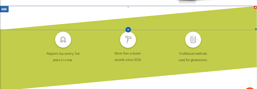
Say “Cheers!” to the latest template in your dashboard - the Winery Landing Page. It’s a handy one-pager that’s perfect for promoting special events, promotions, sales, etc. It has a beautiful diagonal design that you can recreate in another template (see instructions below) or save as a Section and reuse over and over again.

This landing page is designed to direct visitors towards a single goal - to reserve a spot for an event. Of course, it can be adjusted to suit any goal or campaign that your customers have. The design is simple but sophisticated, with an elegant diagonal section contrasted by eight tidy circles in the photo gallery.
How to create a diagonal section
With a bit of graphic editing, you can create a diagonal section in your websites just like the one in this template. (Of course, you can also save these rows as a Section, and simply reuse in any other website. For more on how to save as a Section, click here).
Step 1. Use Photoshop or another graphic editing platform to create a triangle with a width of 1920px and a transparent background, and export it as a PNG.

Step 2. Add an Image widget at the bottom of a row and upload this triangle as the image. Set the row to full bleed, make sure it has only 1 column and that the background is an image or color. If it’s a color, make sure it is different from the triangle you created. Add widgets above the triangular shape; for example, text, a button, etc.
The effect is most visible when the section below this one has the same color as the triangle you’ve added.
For a diagonal top and bottom

This effect is created using 3 rows:
Row 1: Full bleed, no spacing, add an image widget with a triangle image (as described above) and set it at the top of the row. Set the row background color to a different color than that of the triangle.

Row 2: Add your content, with as many columns as you like. Make the background row color identical to the color in Row 1.
Row 3: Full bleed, no spacing, add an image widget with a triangle that is the mirror image of the one you added above. Set it at the bottom and set the same row background color as in row 1 and 2.


