

Inner row is a new design option that expands your layout flexibility and allows you to create richer, more complex sites by adding rows within rows. It increases your horizontal design possibilities, so you can create more layouts and designs, simply and quickly.
Inner row is like any other row with only one difference - it can be inside a column. Add an inner row from any row or column context menu.
You can divide inner rows into up to four columns, and add to them any element that you want. Think multi-column service pages. Think complex hero image. Think multiple columns with icons and text.
To give you an idea of the possibilities, scroll down to see stunning examples along with simple instructions for recreating these rows in your sites.
Hero image with side-by-side buttons
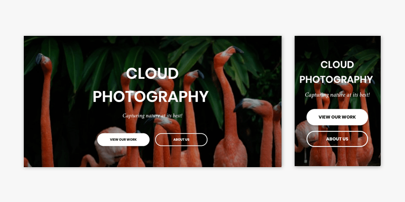
- Start with a row that has a single column, background image and text.
- Add an inner row. (It automatically has two columns.)
- Add a button to each column in the inner row.
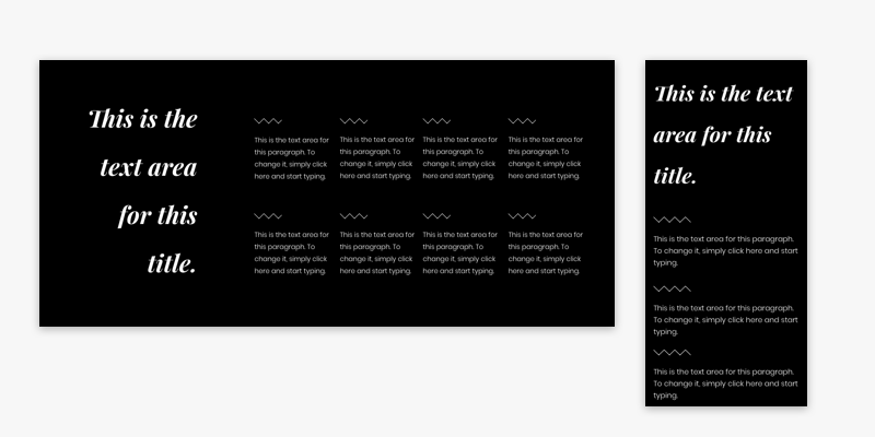
Six-column row
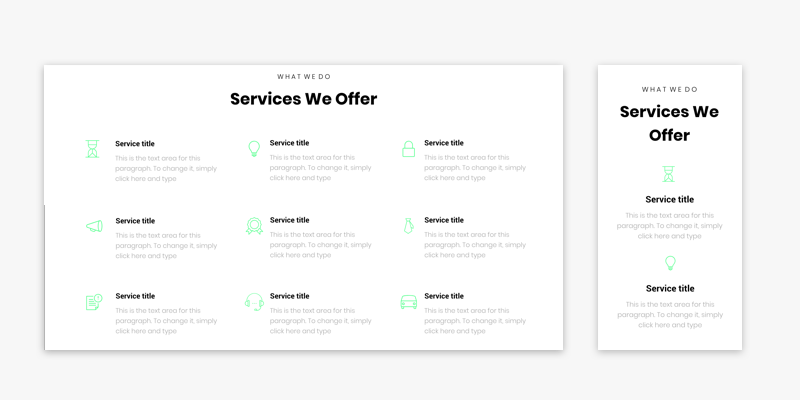
- Start with a row and split it into three columns.
- Add inner rows to each column. (Each one automatically has two columns.)
- Add an icon widget to each inner row left column and a text widget to each inner row right column.
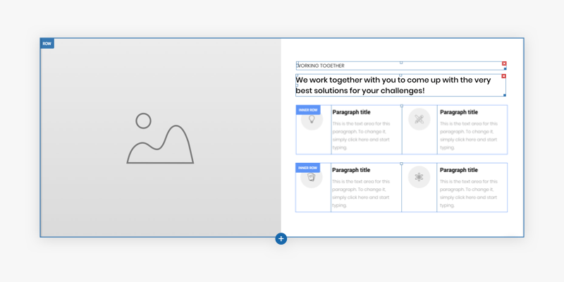
Grid with multi-column cards
Start with a row that has a gradient background color and three columns.
Add an inner row to each column. (Each on automatically has two columns.)
Set each inner row background to white, apply an outer shadow, and add 20px padding on all sides.
Add an image icon to each inner row left column, choose the round layout, and add a shadow. Add a text widget to each inner row right column.
Multi-column section with image
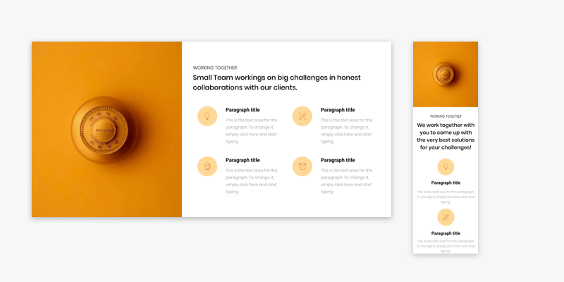
- Start with a full bleed row that has two columns. Make the right column twice as wide as the left one.
- In the left column, add a background image.
- In the right column, add a text widget.
- Beneath the text, add an inner row with four columns.
- Add the following widgets to the inner row columns: Column 1 - icon; Column 2 - text; Column 3 - icon; Column 4 - text.
- Add another inner row and repeat step 5.
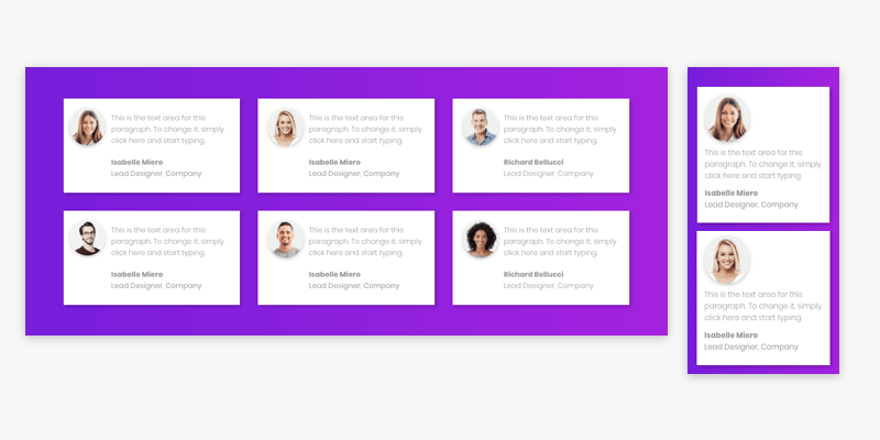
Contact information with icons
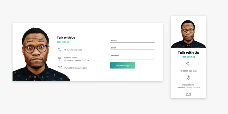
- Start with a 3-column row.
- In column 1, add an image widget and set the image to full image.
- In column 2, add a text widget and then add three inner rows.
- In the inner rows, add an icon widget to the left column and a text widget to the right column.
- In column 3, add a contact form widget (or any other widget you like).
Five-column row
- Start with a 2-column row. Make the right column three times wider than the left one.
- In the left column, add a title.
- In the right column, add a 4-column inner row.
- Add a divider widget and a text widget to each inner row column.
- Add another 4-column inner row and repeat step 4.
Just the tip of the iceberg...
These are just a few examples of how you can use the inner row to make your sites more sophisticated.
Soon, you’ll find these examples and more in various Section categories in the editor.
To explore this new capability on your own, open the context menu of any row or column. Choose Add Inner Row and a two-column row will be added within the existing row or column.