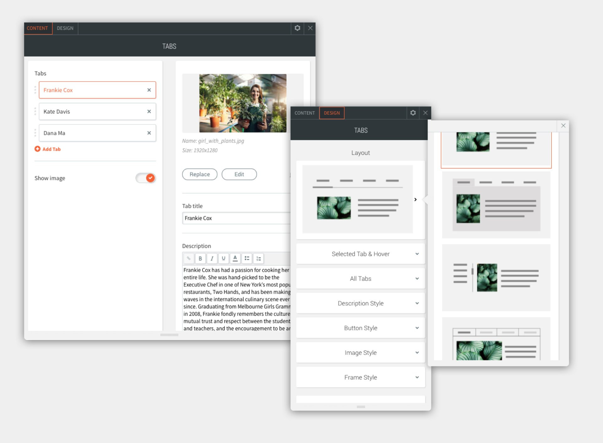
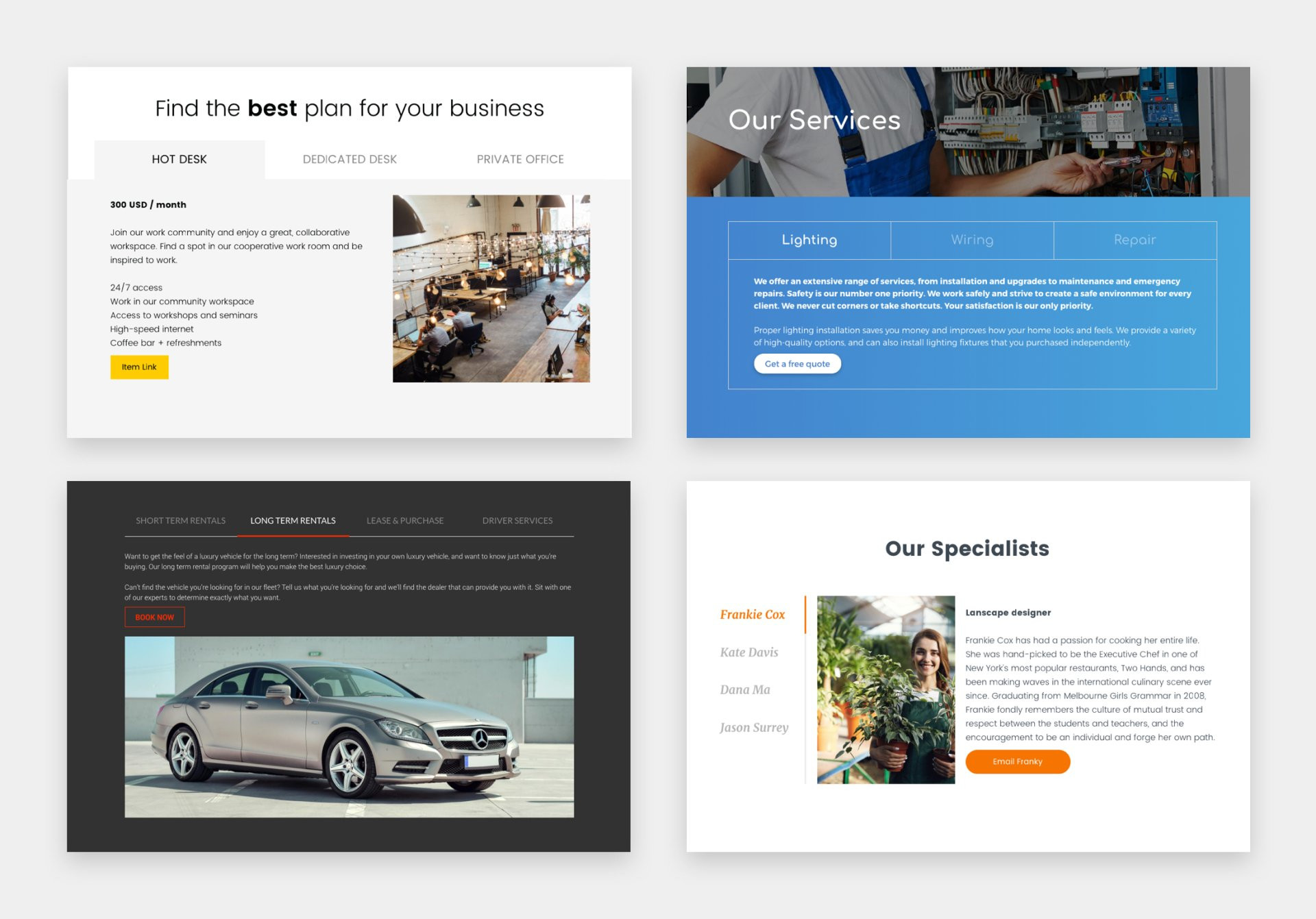
The new Tabs widget is an excellent way of displaying content efficiently on your site. Visitors navigate between tabs (rather than scroll through long text) to view related content. Tabs are a great way of showing related content such as Services, Plans or Team members in compact, connected sections.

You have several layout options to choose from, and can add as many tabs as you like (we recommend no more than four or five).
Each tab can contain a label, title, description, image and button, and each of these elements is fully customized.
Tabs examples, to get you started

Friendly Tab Tips
Here are some simple tips to help you make the most out of this new design widget:
1. Arrange tabs in a logical order: Think about what order makes the most sense for users, and arrange the content accordingly.
2. Support text with images: Images make tab content more attractive and easier for site visitors to understand at a glance.
3. First tab is preselected: So make sure it’s the most important one.
4. Use clear, short labels: Use plain language in the label, so users know exactly what to expect, and keep the text short.
5. Capitalize with consistency: You may choose First Letter Caps or ALL CAPS for your labels. Whatever you do, make sure it’s consistent.
6. Help users know where they are: Do this by customizing the Selected Tab & Hover in the Tab Design editor.

