

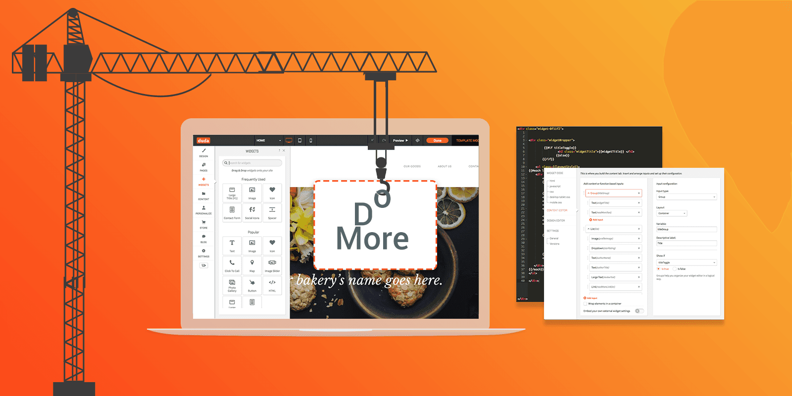
Our Widget Builder gives you the unique ability to build your own widgets to meet your customers’ needs. Now, the Widget Builder has even more options, with expanded content and design capabilities, so you can build more sophisticated widgets, with increased functionality, while maintaining a simple, consistent, user-friendly UI.
Roundup of the highlights
You’ll find a variety of powerful Widget Builder improvements, all of them geared towards increasing the functionality, flexibility, and user-friendliness of the widgets you build. Here’s a list of what's new:
Conditional Display
This enables you to display the relevant elements in the editor according to user selection.
For example, if you build a widget that includes a Title, you can choose to show the Title editing component only if the user has added a Title. If the user doesn’t add a Title, the Title editing component will be hidden.
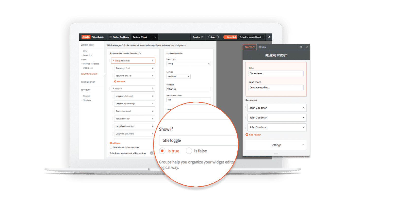
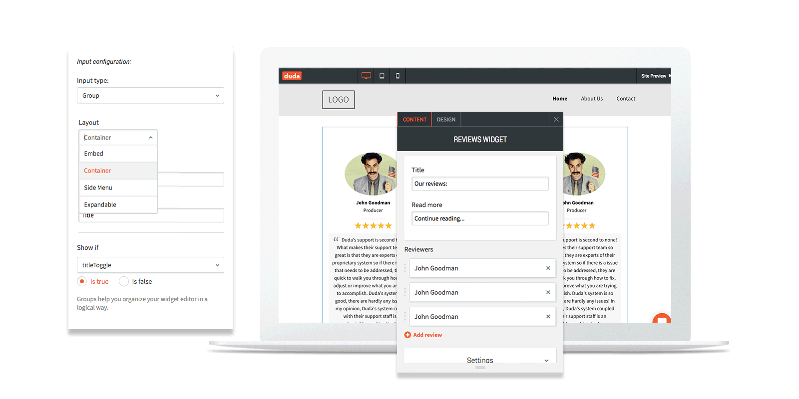
Group
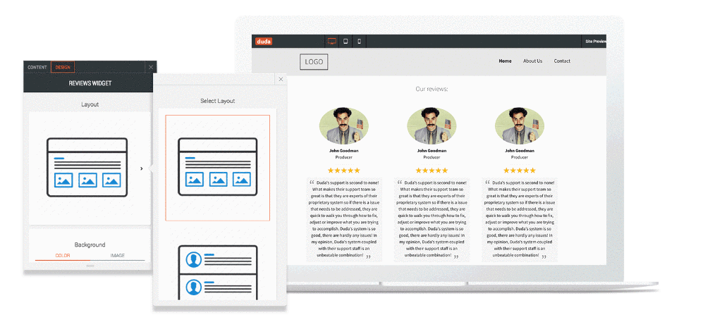
Improve the UI in both the Content and Design Editors by combining related components into logical groups. Choose one of four layouts (embed, container, side menu and expandable) for displaying the group.
For example, you can place all the elements that relate to Settings in a Group and then choose to show the Group in a side menu or container.
First, choose which components belong in the Group.
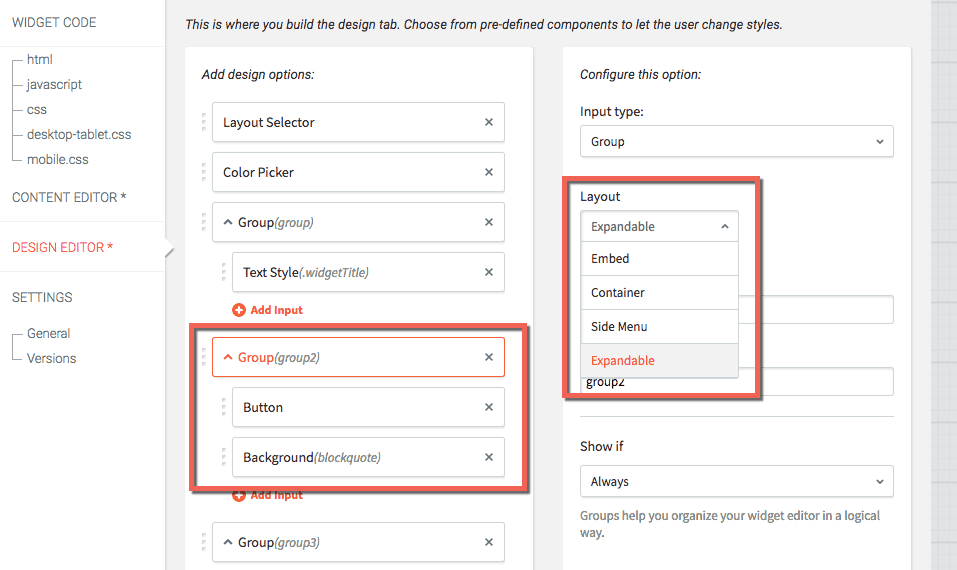
Then, choose the Group layout:
- Embed shows it directly inside the editor.
- Container sets it in a white background in the editor.
- Side Menu displays when clicked to one side of the editor.
- Expandable displays when clicked inside the editor.
Layouts
Similar to the layout element in widgets (for example, in the Image Gallery), you can now create several possible layouts for your widget, so users can choose how the widget will be displayed on their websites.
Build the layouts in HTML and upload an image for each layout, to be displayed as a preview in the editor.
By adding multiple layout options, you enable widget users to decide how the widget appears.
Icon
You can now incorporate the Icon widget into any custom widget that you build. The icon selection comes from the standard icon library, so you’ll have hundreds of icons to choose from. This makes it easy to build a widget that features an icon and text, for example, quickly and easily.
Date Picker
Add a date picker to your widget to make it more timely and current. The date picker can display either a specific date or the current day. For example, you can use it to build a widget that lets visitors know whether a business is open at the specific time that they visit a site.
Color Picker
Your design flexibility is greater, as you can enable users to customize the color of any element you want. For example, you can now allow users to select the color of a button border, divider, image and more.
CSS Slider
Add a slider controller to your widget and enable users to control elements according to pixels or %. For example, you can use the CSS Slider to control the padding around a button or image.
Image Design Input
This input contains all the relevant editing elements for images, and includes width, height, border, corners, and shadow. You’ll save time when you build your widget, and enable maximum flexibility to users.
Rounded Corners
You’ll have more design flexibility in any element with a corner, and enable widget users to adjust each corner of an element individually (or all four of them at once).
Expanded Design Editor Inputs
You now have the same functionality in the Design Editor as you’ve had until now in the Content Editor, with the addition of several generic input fields including dropdown, toggle, radio buttons, and more.
This enables you to create design configurations not provided by YDA by default.
Build Better Widgets for Your Customers
When it comes to building customized widgets for your customers, the only limit is your imagination.
Content inputs - https://www.duda.co/developers/widget-builder/content-inputs
Design inputs - https://www.duda.co/developers/widget-builder/design-inputs